Posts

Showing posts from September, 2009

They Can Read Your Mind

Image
September 25, 2009 (Wired) - Scientists are one step closer to knowing what you've seen by reading your mind. Having modeled how images are represented in the brain, the researchers translated recorded patterns of neural activity into pictures of what test subjects had seen. Though practical applications are decades away, the research could someday lead to dream-readers and thought-controlled computers. "It's what you would actually use if you were going to build a functional brain-reading device," said Jack Gallant, a University of California, Berkeley neuroscientist. The research, led by Gallant and Berkeley postdoctoral researcher Thomas Naselaris, builds on earlier work in which they used neural patterns to identify pictures from within a limited set of options. The current approach, described this week in Neuron, uses a more complete view of the brain's visual centers. Its results are closer to reconstruction than identification, which Gallant likened to &quo

Excel "X-Bar" Control Charts

Image
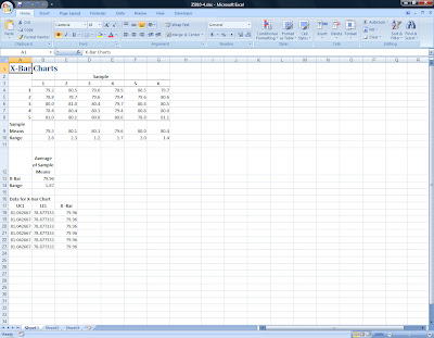
September 14, 2009 - Continuing our discussion of Total Quality Management, today we created "X-Bar" charts in Excel. The case we studied involved a computer repair company that makes visits to homes and business. Repair calls have historically averaged 80 minutes per call. Management wishes to construct "3 Sigma" control charts to decide if service call times are "in control." Six samples of five observations were taken, the sample means and ranges have been calculated and the data are as shown in the following Excel worksheet: The formulas used in this worksheet are: Sample Means: =AVERAGE(B4:B8), enter in cell B9 then copy across to the other five samples. Range: =MAX(B4:B8)-MIN(B4:B8), enter in cell B10 then copy across as before. Average of Sample Means: =SUM(B9:G9)/6 for X-Bar (cell B13) and =SUM(B10:G10)/6 for the Range (cell B14). Using a table of factors for "3 Sigma" X-Bar charts, (Source: Grant and Leavenworth, Statistical Quality C

Excel Pareto Digrams and Run Charts for Total Quality Management

Image
September 9, 2009 - Today in my Operations Management class, we analyzed customer complaint data for a small grocery chain. Over a nine week period, "Tip Top Markets" had been collecting data on customer complaints. Examples included comments such as: "stale bread," "overcharged," "checkout lines too long," "meat spoiled", "out of 42 oz tide," "eggs cracked," and "store not clean." Students first tallied the complaints for each week using five categories and entered the data into an Excel spreadsheet: After calculating total complaints for each category as well as the cumulative percentage, they created a Pareto Diagram and Run Chart as shown: According to the Pareto Diagram, "Tip Top" has real quality issues in the areas of "Out of Stock Items" and "Service and Maintenance." The Run Chart shows over time how, after implementing a quality improvement program, their stores ha

Good Advice for Using Social Networking Sites!

These 10 guidelines were taken from an article by Debra Littlejohn Shinder of TechRepublic . 1: Why are you using a social networking site? The first thing to consider is the nature of the social networking site(s) you’re using. Some sites are geared toward professional and business relationships, while others are more purely social. Some posts that wouldn’t cause anyone to lift an eyebrow on Facebook or MySpace would be considered inappropriate on LinkedIn. This is true even if you have the same contacts on both sites. Think of it this way: You probably don’t behave exactly the same way in the office as when you’re out at a restaurant or bar with friends from the office. There are applications that allow you to link your updates across sites. For example, when you post to Twitter, the post also automatically becomes a status update to your Facebook page. This can save time and effort when used properly. However, if used incorrectly, it can alienate your friends. Twitter followers gen