Excel "X-Bar" Control Charts
September 14, 2009 - Continuing our discussion of Total Quality Management, today we created "X-Bar" charts in Excel. The case we studied involved a computer repair company that makes visits to homes and business. Repair calls have historically averaged 80 minutes per call. Management wishes to construct "3 Sigma" control charts to decide if service call times are "in control."
Six samples of five observations were taken, the sample means and ranges have been calculated and the data are as shown in the following Excel worksheet:
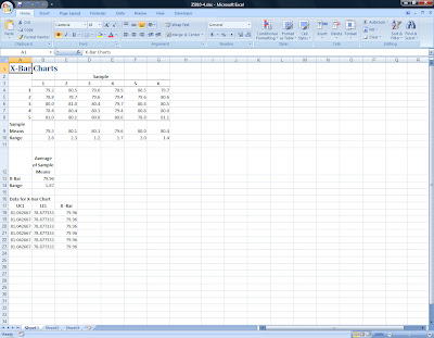
The formulas used in this worksheet are:
Sample Means: =AVERAGE(B4:B8), enter in cell B9 then copy across to the other five samples.
Range: =MAX(B4:B8)-MIN(B4:B8), enter in cell B10 then copy across as before.
Average of Sample Means: =SUM(B9:G9)/6 for X-Bar (cell B13) and =SUM(B10:G10)/6 for the Range (cell B14).
Using a table of factors for "3 Sigma" X-Bar charts, (Source: Grant and Leavenworth, Statistical Quality Control, 1980, McGraw-Hill) we find that the appropriate factor for samples of five observations is ".58."
We next calculate Upper and Lower "control limits" using the following formulas:
UCL (cell A18): =$B$13+(0.58*$B$14)
LCL (cell B18): =$B$13-(0.58*$B$14)
X-Bar (cell C18): =$B$13
Finally, we create a "Line Chart" by copying down the UCL, LCL, and X-Bar values as shown. Adding a new data series, we plot the Sample Means and then, by using "Built-in" for the Marker Type and "No line" for the Line Color we can convert this range to "data points" and see clearly where the sample means fall:
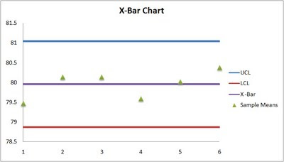
It appears then that service times are in control. Using these same techniques, we were able to create X-Bar, c, and p charts for several other problems.


Comments