Moving Courses Online: MIS 310 Database Management Pivot Chart Example
This summer as our university gets ready for the Fall (as of now we are planning to conduct classes as usual) all faculty have been required to take an online seminar involving Designing for Canvas. In traditional classes we use Canvas for distributing materials and for grading. During the second half of the semester relied on WebEx a lot and I also “FaceTimed” with my own students. For the most part things went pretty well. In my database class, fortunately the class had already done the hard work of designing and normalizing their databases and were in a good place to make the transition. But an entire semester online? That, I believe does in fact require more preparation. So I thought I would share an example I used during the “Canvas” class I just took. I could easily present this project online with minor changes if necessary, moving the “lecture” to WebEx.
This example is taken from my MIS 310 - Database Management class. MIS 310 is required of all Business Analytics Majors as well as taken as an elective by many Management and Marketing majors. Primarily it focuses on the design and development of databases for business. As information has real value to an organization, it is important not only to store data efficiently and effectively but also in a way that allows statistical analysis and data visualizations to be performed so that informed decisions are made. “Buried in Data” could be used to describe the situation many businesses find themselves in if they are unable to use analytical tools to make sense of the data they have captured through transactions. In this project students were asked to import data into Microsoft Excel from a database and analyze it using statistical measures as well as creation of a three-dimensional chart allowing visualization of the data.
Context
Lecture consisted of a brief history of data analysis in business, from early transaction processing systems to data mining and business intelligence. To emphasize the relevance of the subject and give the students an appreciation of just how much raw data is out there, I made available on Canvas an Infographic which contained recent facts concerning common applications such as texting, Facebook, and Google Searches, and how much data is generated every minute. Basic definitions and terminology were covered as well.
We then discussed the importance of Data Visualization as part of the field of Business Analytics and where else they were likely to encounter it. Next, I presented examples from other software programs such as SPSS, Power BI, and Tableau. Almost all the students previously had me for the Statistics Content Module in BUS 209. In that class we often used “Crosstabs” to analyze different dimensions of data and calculate statistics where they would intersect.
Layout
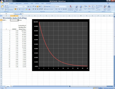
All resources were made available to students through PDF, Excel, and Access files on Canvas. During the second class session, I demonstrated the creation of “Pivot Tables” and the associated interactive chart as outlined in the PDF file. Students could download everything during class (including sample data) and follow along. We discussed different ways to “look at” the data, what statistics or metrics would be appropriate, and then I took questions from the class. I’ve included a screenshot of our completed “in class” example:

On the third day of class, students were expected to download data from their semester database projects, import it into Excel and create a Pivot Chart of their own using whatever measures and type of chart they deemed appropriate. I spent most of this class period helping them and offering advice. These completed assignments were to be e-mailed to me as attachments.
Future Enhancements and Application to Learning
Although I have taught this class this many times before and was generally pleased with the results this semester, there are a few things that I would like to do the next time I offer MIS 310. I am considering including one or two videos on Canvas to show examples of Data Visualization being used in the workplace. In addition I want to include links to selected articles for student research. And, particularly for this assignment, perhaps a quiz over terminology. All files will be accessible via links in the assignment, including the “Infographic,” PDF and Excel files, data files, and videos. I will continue to use email to review work in process or offer suggestions to students.